
From Robert Beatty’s “Currents” to Neil Krug’s “The Slow Rush”
“Currents” (2015)

Robert Beatty is the artist behind the striking artwork for Currents, the 2015 album by Tame Impala. Beatty lives in Lexington, Kentucky and has dozens of fantastic examples of cover art and illustration in his portfolio. Beatty is also a musician (or sound artist?) in his own right. He performs experimental synthesized music under the name Three Legged Race, and designs audiovisual art like his fascinating 2019 installation “Suspended Passthrough” at Atlanta Contemporary.
Speaking with Pitchfork.tv in 2015, Beatty said that he prefers to make art that provokes questions rather than providing answers:
I don’t ever gravitate towards art for answers. I always want to come away with something with more questions. . . . It goes back to it being a gateway to something. I think that that’s like a really important part of how I developed as an artist and a musician. It’s like these little doors that you are able to open up and they lead off to a pathway that just keeps working off in different directions.

So what gateways of meaning does Beatty’s artwork open for Currents?
At the suggestion of Tame Impala’s Kevin Parker, Beatty based the album cover on a phenomenon known as “vortex shedding.” In fluid dynamics, vortex shedding occurs when an object disrupts the flow of air or water, like the eddies that form when a river passes around a rock. But we do not have a “real life” depiction of vortex shedding on the cover. Instead we have a representation that appears closer a mathematical model of the principles, which you can see here in a visualization by Amanda Ghasseai. We are left with shapes and patterns — parallel lines in black, purple, and shocking red-orange, all of which are disrupted into waves and swirls by a silver sphere.

“Experience of form rather than, say, as a story or scene”
Beatty’s abstraction, his choice to not represent familiar objects or scenes, orients us to thinking about the album as an experience of form rather than, say, as a story or scene. That is, the vibrating lines and shapes on Beatty’s cover prime us not so much for thinking about the concrete meanings of the lyrics, but rather for attending to the interactions between the shapes and trajectories of the melodies, rhythms, and textures.
Kevin Parker’s production, too, nudges us away from thinking primarily about the meaning of the lyrics. His vocals are processed with a heavy dose of echoey reverb and double tracking, making it difficult to pay attention to the words beyond the shapes and textures of their sounds. And, rather than featuring the lyrics out in front of the instrumentals, Parker’s studio mix weaves them in as just one element of the symphonic tapestry we hear in the album.

By thinking about the visual and sonic aspects of the album in terms of form, we begin to notice links between the creative process that underpin both. One of these shared processes that sticks out to me is layering. In his interview with Pitchfork.tv Beatty notes a lot of what gives his designs their character is the technique of masking. Though Beatty works primarily in graphic design software, the process of masking in these programs hearkens to vintage airbrush techniques that were used in the designs of many records from the 1970s and 80s.

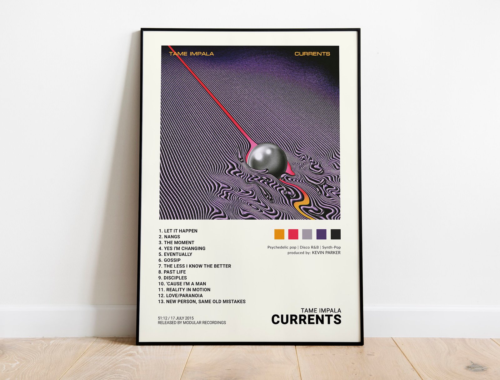
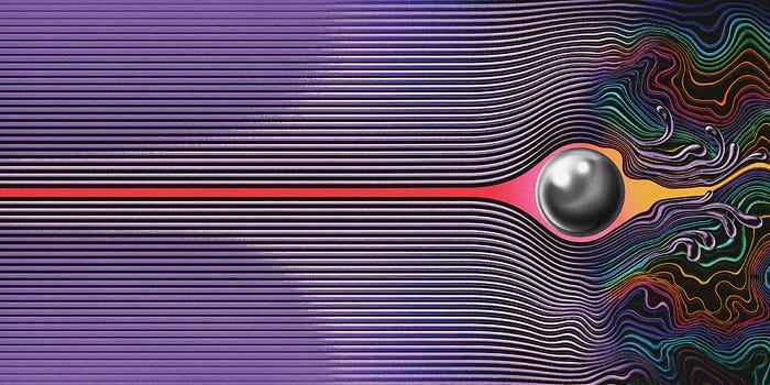
Masking allows the soft and diffuse effect of the airbrush (essentially spray paint) to be contained within shapes that have sharp well-defined boundaries. Notice, for example, how the silver ball on the cover is perfectly round, but within the ball the soft shading produced by the minuscule flecks of airbrush “paint” give it depth and a sense of spherical dimensionality. Beatty notes that some elements in his designs might have one hundred layers, each a field “masked” to be colored and shaded individually. The layering of each of these masked fields produces the final product.
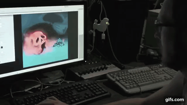
Because Tame Impala is a solo recording project by Kevin Parker, he is also necessarily working in the processes of layering. You get a sense of what it takes for Parker to create his lush soundscapes in this video from the Currents recording sessions. Parker begins by looping a bass line, adding a drum beat, and then layers synthesizer and guitar chords over top. Each element fits squarely into two, four, or eight bar loops. Eventually, Parker has saturated the sonic space completely, immersing the listener in an environment filled from the scintillating high trebles down to the rich full bass.
The processes of visual and sonic layering on Currents is so compelling because of the ways Beatty and Parker produce lush, evocative environments by manipulating relatively simple elements — shapes, colors, and gradients, or brief looped melodies and rhythmic patterns.
What do you think? What does Beatty’s cover do for Currents? Would the album be the same without it?
Let us know in the comments.
“The Slow Rush” (2020)
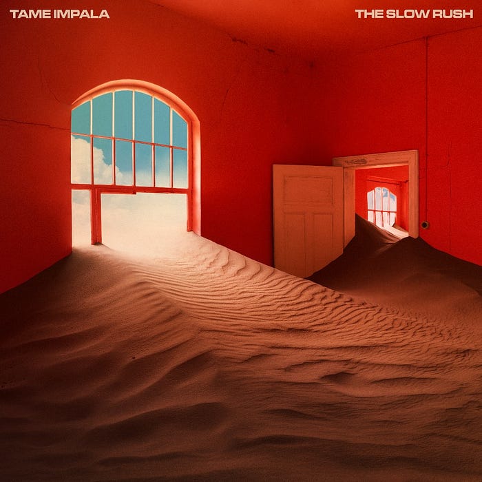
In the 1910s, Kolmanskop was one of the richest towns in the world. With a casino, a concert hall, bowling alleys and an ice factory, as well as a school and a hospital, it was a little slice of luxury in the middle of the African desert — an incongruous mix of lavish European-style buildings and homes that wouldn’t look out of place in the Bavarian Alps, surrounded by windswept sands and brilliant blue skies. In its heyday, a million carats of diamonds were mined there in a single year — over 10% of the world’s total at the time.
By the 1930s, Kolmanskop’s diamond supply was running low, so its residents packed up and headed south. Now, the place is a ghost town. Sand dunes have engulfed its buildings, propping open peeling doors and filling rooms from floor to ceiling. Its crumbling buildings are slowly being swallowed up by the desert — creating an eerie ruin that now attracts thousands of tourists each year. Look it up on Instagram, and you’ll find 11,000 images.
This fascinating place also provided the inspiration for the cover art for Tame Impala’s new album, The Slow Rush. Photographer Neil Krug travelled to Kolmanskop with Tame Impala’s Kevin Parker last year, shooting a series of images in buildings around the town and editing them to create surreal interiors in vivid blues and reds. There’s something familiar but otherworldly about his artwork, which perfectly captures the dreamy, psychedelic tone of Parker’s music.
A “deep dive into the oceans of time.”
It’s not just about the stylised film atmosphere or a phenomenon of abandoned architectural monuments. It’s also about a piece of hidden history with a twisted ending. All these images are perfect visual synonyms for Tame Impala’s music which also creates such extraordinary and psychedelic (audio-visual) landscapes.

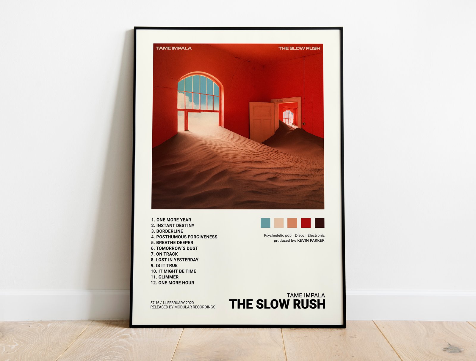
“The album cover features a symbol of humanity all but swallowed whole by the surrounding environment, as though in the blink of an eye,” writes Neil Krug about his album sleeve. Trust him and be prepared for the final deep dive. It’s going to be strange, nostalgic but also revealing and inspiring.


What do you think? What does Neil Krug’s photography do for The Slow Rush? Would the album be the same without it?
Let us know in the comments.